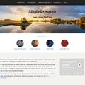
New menu, new home: fotocommunity presents itself in a new “look & feel”.
Hello!
New menu, new home: fotocommunity presents itself in a new “look & feel”. Here we put together those changes, which are particularly useful for you. Detailed information you will find at this point: [ link ]
At just one click: your personal information
From now on you will reach your own personal photo community with just one single click. When you are logged in, it doesn´t matter where you just are on the fotocommunity-website: move the mouse over your name on the top right of the menu and find all the pages that relate to you personally. And if you click on your name, you will reach the "My Community"- area.
In one place: direct entry to the main pages
The most important thing in one place: your mailbox, your photos, the photos of your friends, your discussions - the introduction to this popular site is easier than ever. We placed them all in four small icons at the top right corner of the menu next to your name. With one click you will reach each of these areas at any time. And: whether there are new mails for you, new comments to your photos or in your discussions or pictures of your new friends - the four symbols keep you always up to date.
Know where you are – at any time
In the new menu below the fotocommunity.logos you can recognize at any time where you are currently located. All the sections, subsections and divisions are clickable and allow quick navigation to adjacent areas.
Tidy: The photo areas
Channels, Gallery & Co., competitions: you can reach all photo areas immediately through the menu item "Pictures" at the top left.
Switch to a different language of fotocommunity
Now at the bottom: if you would like to leave the German-speaking community to one of the four other communities, you will find the link to the desired language version in the footer, at the bottom of each individual page.
The new home page
Modern, clear, better quality: the home page shows up with a new approach. The photo on the front page is in main focus - working through the significant expansion. Below the photo are shown news of popular areas of fotocommunity. Be inspired: below these news you will find a display of a small photo gallery of the most popular new models and photos.
What´s next?
The entire side of the fotocommunity will be adapted step by step to the new, simpler design. In preparation of the changes the program code also will be rewritten, so that long desired enhancements to areas could be implemented faster and easier. Next, the forum will be renewed - and then we look forward to the new enlarged preview images and a new messaging system
We invite you to try!
Greetings
Your fotocommunity team


Commenti 0
La foto non si trova in discussione. Per questo in questo momento non può essere commentata.
Cancella commento
Eliminare commento e risposte