
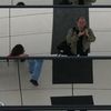
CAFE
Die gespiegelte Dame kommt bei mir öfters vor ;-)
Commenti
14


Informazioni
| Sezione | Spezial: Konzept- Fotografie |
| Visto da | 1.155 |
| Pubblicato | |
| Lingua |

|
| Licenza |
Inserire la foto in un'altra pagina

Aggiungi il seguente link in un commento, una descrizione o un messaggio per inserire questa immagine.
Link copiato...
Clicca sul link e usa i tasti "Strg C" [Win] oppure "Cmd C" [Mac] per copiare il link.
Condividi su Messenger
Inserisci il seguente link nel campo commento della conversazione desiderata su Messenger utilizzando 'Incolla' per inviare questa immagine nel messaggio.
Link copiato...
Clicca sul link e usa i tasti "Strg C" [Win] oppure "Cmd C" [Mac] per copiare il link.
Wolfgang F. Brack 05/05/2006 10:50
Das gefällt mir gut und ein Konzept sehe ich auch dahinter. Bildaufteilung und Schnitt gefallen mir. Am meisten beeindruckt der Kontrast zwischen klarer, sachlicher Schrift und den diffusen, bunten Spiegelungen. Wirklich fein.LG,
Wolfgang
Günter Weigl 02/05/2006 17:17
@herbertich habs vermutet dass die situation keine andere wahl zugelassen hat
lg günter
(Don't fear) the Reaper 02/05/2006 15:48
Doch, das kommt gut.Ich würde sogar sagen, es knallt!
Die Schrift scheint ja fast aus dem Bild herauszutreten.
Und toll die Farben und die für Dich so typischen verzerrten Spiegelungen.
Und ganz ohne kahle Äste (Insider-Scherz) ;)
LG Klaus
ewaldmario 02/05/2006 11:33
voll schüppelig !!!Nicolae Donat 02/05/2006 0:08
..gschmackig die farben.Herbert Schueppel 01/05/2006 22:52
@Günter: Hab ich mir auch überlegt. Weiter oben geht nicht, ohne den Kopf noch weiter anzuschneiden. Weiter unten auch nicht, ohne den bunten Teil zu verlieren. Entsprechende Platzierung bei einem größeren Ausschnitt würde zu viel von weniger interessanten Elementen ins Bild bringen. Daher diese Position der Schrift.lg Herbert
Kai Aust 01/05/2006 22:44
oh ja, jetzt ein kaffee...gut.
mfg kai
Günter Weigl 01/05/2006 22:26
der cafe ist's der uns so schmecktschönes spiegelbild
wie würde es wirken wenn der cafe noch etwas höher oder tief platziert wäre?
Christian Fürst 01/05/2006 22:02
sehr attraktive Spiegelung, herbertWolfgang Weninger 01/05/2006 20:33
mir wär die Hübsche zwar als Bedienung lieber, aber auch ihr Spiegelbild gibt ordentlich was her :-)lg Wolfgang
KaPri 01/05/2006 20:28
ja, die dame kam mir gleich bekannt vor...gefällt mir!
lg k
Karl-Heinz Omet 01/05/2006 19:32
schön grafisch :-)LG
Karl-Heinz
Barbara Homolka 01/05/2006 19:28
... Deine spiegelbilder haben immer was:-)))Ivy Ó Donóghúe 01/05/2006 19:27
.. ich nehme einen *lächelt*