
**
Cara 2
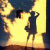
Erfurt 2019
Spiegelung
Cara 1
**
Clau.Dia´s
Commenti
21


Informazioni
| Sezioni | Spezial: Ästhetik der Sichtbarkeit Spezial: Gespiegelt Spezial: Color Fine Art |
| Cartelle | Schau/Fensterblicke |
| Visto da | 15.034 |
| Pubblicato | |
| Lingua |

|
| Licenza |
Hanno messo mi piace


Preferite pubbliche

Inserire la foto in un'altra pagina
Aggiungi il seguente link in un commento, una descrizione o un messaggio per inserire questa immagine.
Link copiato...
Clicca sul link e usa i tasti "Strg C" [Win] oppure "Cmd C" [Mac] per copiare il link.
Condividi su Messenger
Inserisci il seguente link nel campo commento della conversazione desiderata su Messenger utilizzando 'Incolla' per inviare questa immagine nel messaggio.
Link copiato...
Clicca sul link e usa i tasti "Strg C" [Win] oppure "Cmd C" [Mac] per copiare il link.
Herr Mato 17/08/2022 11:40
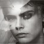
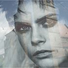
Ganz tolles Portrait und Gesicht, das mich ganz stark an Meg Ryan erinnert.--Manfred
Karl-Ernst Wodzicki 16/02/2022 22:12
Die Spiegelung erscheint mir geschickt austariert. Wie die Türme parallel in den Gesichtshälften liegen und die Ecken dabei über den Augen, ist wirklich gut gestaltet.LG Karl-Ernst
- Andre - 10/02/2022 20:18
Gefällt mir sehr gut!Claudia Britt 10/02/2022 13:43
Die Farbversion gefällt mir hier besser. Sie verleiht dem Bild einen Aquarelltouch und macht es dadurch mehr zu etwas Eigenem. Das Ziffernblattpiercing ist cool ;-) Mir gefallen hier die Oberleitungen der Verkehrsführung. Durch sie wirkt das ohnehin schon sehr kalt wirkende Porträt zudem noch verstörend.Hans-Dieter Illing 09/02/2022 0:02
In dieser dezenten Farbigkeit gefällt es mir auch einen Ticken besser. Aber das ist Geschmackssache.jeverman 08/02/2022 17:12
Beide Varianten haben ihre Stärken finde ich.SW ist "konzentrierter" und dynamischer;
Farbe wirkt wärmer und harmonischer finde ich.
LG Andreas
Astrid Lohr 08/02/2022 14:17
Finde diese Variante besser geerdet und ausdrucksstärker, auch durch die dezenten Farben. VG AstridKlacky 08/02/2022 13:20
Das gut, auch wenn die Farbe ein wenig stört.Das Dach zieht den Blick auf sich.
Das andere finde ich zu eng.
Gruß,
Klacky
UAW 08/02/2022 12:21
Ich glaube, ich tendiere ausnahmsweise zur farbigen Variante, vor allem weil das Bild weiter gefasst ist. Toll mit den Spiegelungen. LG UteCaroluspiel 08/02/2022 11:20
auch in dieser Version sehr sehenswert.ciao Philipp
Manfred Schneider 08/02/2022 11:15
Yes...Starke Bildwirkung.
lg manfred
Frau Luna. 08/02/2022 10:39
Noch besser als die erste, finde ich!