
MMK - Frankfurt .
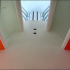
Museum für Moderne Kunst / Frankfurt.
Commenti
9


Informazioni
| Sezione | Viaggio: Frankfurt am Main |
| Cartelle | MMK - Frankfurt |
| Visto da | 2.431 |
| Pubblicato | |
| Lingua |

|
| Licenza |
Preferite pubbliche

Inserire la foto in un'altra pagina
Aggiungi il seguente link in un commento, una descrizione o un messaggio per inserire questa immagine.
Link copiato...
Clicca sul link e usa i tasti "Strg C" [Win] oppure "Cmd C" [Mac] per copiare il link.
Condividi su Messenger
Inserisci il seguente link nel campo commento della conversazione desiderata su Messenger utilizzando 'Incolla' per inviare questa immagine nel messaggio.
Link copiato...
Clicca sul link e usa i tasti "Strg C" [Win] oppure "Cmd C" [Mac] per copiare il link.
Marco Pagel 17/04/2009 15:12
Wie in der gesamten Serie... die pastelligen Farben und vor Allem den sauber durchdachten (und umgesetzten) Aufbau mag ich sehr.grMP
Hans-Wolfgang Hawerkamp 17/04/2009 11:32
top sache!!Gruss Wolfgang
°°° celle °°° 17/04/2009 11:11
sehr.........Isolde Stein 17/04/2009 11:02
.....ergibt so eine ganz neue Sehweise - gelungenWunderbares Foto mit toller grafischer Wirkung
LG Isolde
sommerwind 17/04/2009 9:49
Na, das ist ja mal wieder ganz nach meinem Geschmack: Grafik, farblich lebendig, aber ausgewogen - einfach in sich harmonisch. Ob ich auf's Drehen gekommen wäre - hmmm? Aber gefällt mir gedreht so sehr gut.Die "Flecken" allerdings auf den grauen Flächen, die hätte ich wohl weggestempelt, da bin ich mir nun wiederum sicher. LG sommerwind
tommY s. 17/04/2009 9:48
grandiose formen und farben, tolle symmetrie.vor allem der rot kontrast wirkt !!!
lg tommy.
my Way 17/04/2009 9:25
sehr gut, auch so...LG my Way
Werner Sperl 17/04/2009 7:05
@ JA!Annemarie Quurck 17/04/2009 7:02
Kann es sein, dass Du das gedreht hast?Falls ja, ich hätte es auch getan.
lg annemarie