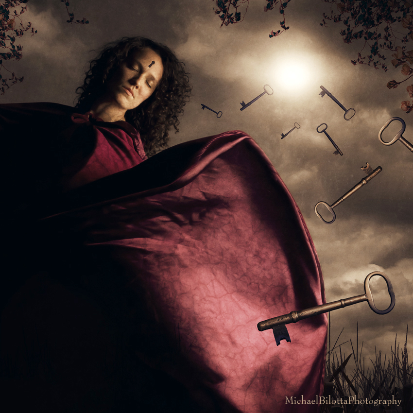
a Willful Loss of Memory (revisited)
I have been working on this type of art or photography for two years now. Some things have changed in that time, but the one constant has been developing a concept through symbolism and metaphor. Some ideas are better than others. This is one of the earliest ones still in what I call my "portfolio proper." I liked this one a lot. I found it to be clean and simple, but very focused. It was the first image I used keys as a metaphor too. Having recently completed one using keys, this one was on my mind for a revision.
The colors of the original were a little sickly, the overall image was dark, I overused textures, and the wrinkles on the robe bothered me. But the most vexing thing about the original was the use of stock imagery in it. When I first started doing photo composites, I would search the internet for textures and anything else needed. The keys used in the original were not very good - I found the key image on the internet and it looked more like a graphic - it lacked depth and dimension. I did the best I could with it, but still didn't like the results. The sky was another stock image, and it was gritty and noisy.
Eighteen months later, I decided to take a crack at fixing the items that bothered me. One of the things I have discovered and adopted since that time is by shooting all elements with my camera, the same camera, the blends are much better. Anytime you grab a stock image online, it will be lossy, a jpeg usually, and you never know what camera or setting were used to shoot that picture. By shooting all elements with my camera, I know I can match settings, I know the quality will be the same. There is also a pride in knowing that all the pieces are my photos. I do not condemn anyone who uses stock - that would be hypocritical since I have in the past, but now, for me, it feels like cheating .
I found some antique keys this year and one was very similar to the original. I matched the original sizes and positions as best I could and replaced the stock image with my key. I added one of my skies. I added a few touches of landscape to frame the model a little bit. I removed most of the seams and wrinkles on the robe. It was a pretty simple thing to update this image and make it more in keeping with my portfolio.
A Before and After version of the original and the new one side by side can be seen on my Facebook page:
www.Facebook.com/MichaelBilottaPhotography
Here is the introduction from the original:
Sometimes it is easier to forget, lock memories away and throw away the keys.
Model: M


Commenti 0
Cancella commento
Eliminare commento e risposte