Washington, Georgia Graphic Layout
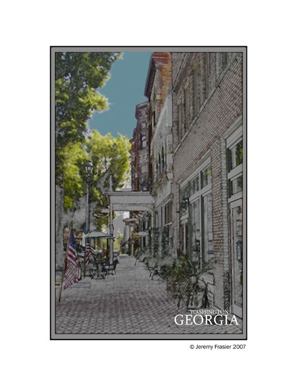
The second image of the set. This was modified using Photoshop CS3. I created this file using 3 layers. The original background layer, and colored pencil layer, and a graphic pen layer that was set to soft light (to give it a little more definition).


Jeremy Frasier 19/12/2007 6:42
Sorry for the late reply, I don't get time to check into my fotocommunity account as often as I would like. Your border suggestion is a great idea.Have a Merry Christmas everyone 8)
Robyn Raggio 24/08/2007 5:05
I would suggest one thing however, to make the small border around it white that is now gray. The black strokes would mimic the linear qualities of the illustration and reinforce the punch of contrast that the text gives to the whole piece.Robyn Raggio 24/08/2007 5:03
As a graphic designer as well as photographer, I vote for this one. The scene pulls the viewer in, the focus of color is on the things that have symbolism or add loveliness to the scene. Very nice choice of fonts and placement. Classy.Best regards,
Robyn